As one of the most highly regarded cross-cultural designers/typographers, Pat has written and published articles to advance the field and created many commissioned public projects with polylingual typography, both nationally and internationally.
This monograph is the first of a series published to advance the understanding of and appreciation for polylingual design and typography in the context of cross-cultural visual communications.
The name, as the only immortal signifier of a mortal, has a life in itself. In China a person’s name has a fate-twisting power to change reality. This was uniquely true for Feng Shan Ho because his name reversed the fate of Jewish refugees escaping
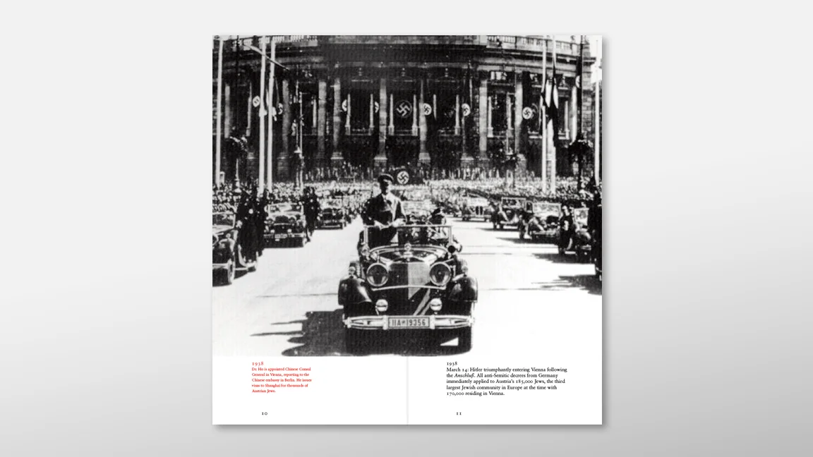
the Holocaust. In 1938–1940 in Vienna, Dr. Ho rescued thousands of Austrian Jews with a stroke of his pen by signing visas to Shanghai, China. Unfortunately, Dr. Ho’s name was forgotten in Holocaust history for over 60 years up until his death in 1997. Perhaps the inherent conflict between languages as distinct as Chinese, German, and Hebrew presents an obstacle to human memory which contributed to Dr. Ho’s belated recognition. The Shanghai visa bearing Dr. Ho’s name and formatted entirely in Chinese with vertical writing style was just unreadable, unpronounceable and indecipherable for the Jewish survivors.
Immortal Signifier was conceived to restore a World War II memory fragment, using the design elements and concepts of the trilingual plaques erected in Shanghai (2008) and Vienna (2015) to immortalize Dr. Ho’s legacy and his posthumously bestowed title “Righteous Among the Nations.” The book provides a typographic lens through which to ‘read’ history, culture, language, and memory, investigating the aesthetic and symbolic functions of type beyond and behind the text itself. This dual function of type is intrinsic to the ideographic principle of Chinese typography since the beginning of pictographic writing in the 17th century bc, diffused across time and space within and beyond China.
It is this ancient Chinese concept of visual thinking that remains relevant to modern Western culture and serves as the underlying theme throughout the book; providing a visual strategy for polylingual typography and bringing about a synthesis of Dr. Ho’s cross-cultural legacy of hope, freedom, and righteousness.
A stroke, a letter, a word, a sentence, a paragraph, a page, and a book: all essentially linear constructs of the typographic mind put into action. There is a typographic order of “things,” a logical sequence from the most simple, to the most complex. A line, a space, a rectangle, a margin—an aesthetic device for visuality. As an infinite list of signifiers, the above lists signify the qualitative/quantitative display of the visual properties of typography: the micro and the macro, the color and the density, the positives and the negatives, the visible and the invisibles; these are some of the typographic paradigms that yield communicative visualization.
Starting with a dot as the point of departure, we journey into the labyrinth of an image making process — dot by dot and line by line. This essential approach could easily be overlooked as we are constantly preoccupied with the speed of technology. But the revelation of a creative moment is often struck, unexpectedly and rewardingly, when we slow down our pace to take a step back. We see more when we are away from a perceiving object (or a surface). As a cross-cultural communicator and design educator, I always remind myself and my students, that too often, we make things unnecessarily, complicated and forget about the basic. It is, indeed, the basic, the essential element, that lays the tacit foundation for us to see, to learn and to discover something new. The stuff that helps us to get there, over and over again, and the most useful advice above all from our teachers is the first design principle, “Keep it simple” This timeless advice, proffered by the first teacher in China, Master Kong, a.k.a. Confucius, has been advocated as a foundation of the Chinese civilization for at least two millennia, “Life is really simple, but we insist on making it complicated”.
What is Hong Kong design?
As Hong Kong continues to transform itself into a global city, so does its design identity. We should reflect a moment and ask ourselves, what is Hong Kong design, how is it characterized, and to what extent is this characterization identified with common attributes?
Ambassadors of Design posed this question through the creation of the Designers Exchange program (DX) as one of a series of actions we have initiated and undertaken. We identified young and up-coming designers and introduced them into international creative communities through exhibitions, open talks, public presentations, studio visits, and cultural walks (Japan 2010, Germany 2011/2012, and Denmark 2012). We then asked the designers to share with us and the Hong Kong community, via DeTour, their experiences. We are proud that our efforts have been recognized and have gained momentum in recent years. Our DX “ambassadors” continue to do excellent work in shaping the design landscape of Hong Kong and beyond.